UX/UI Design
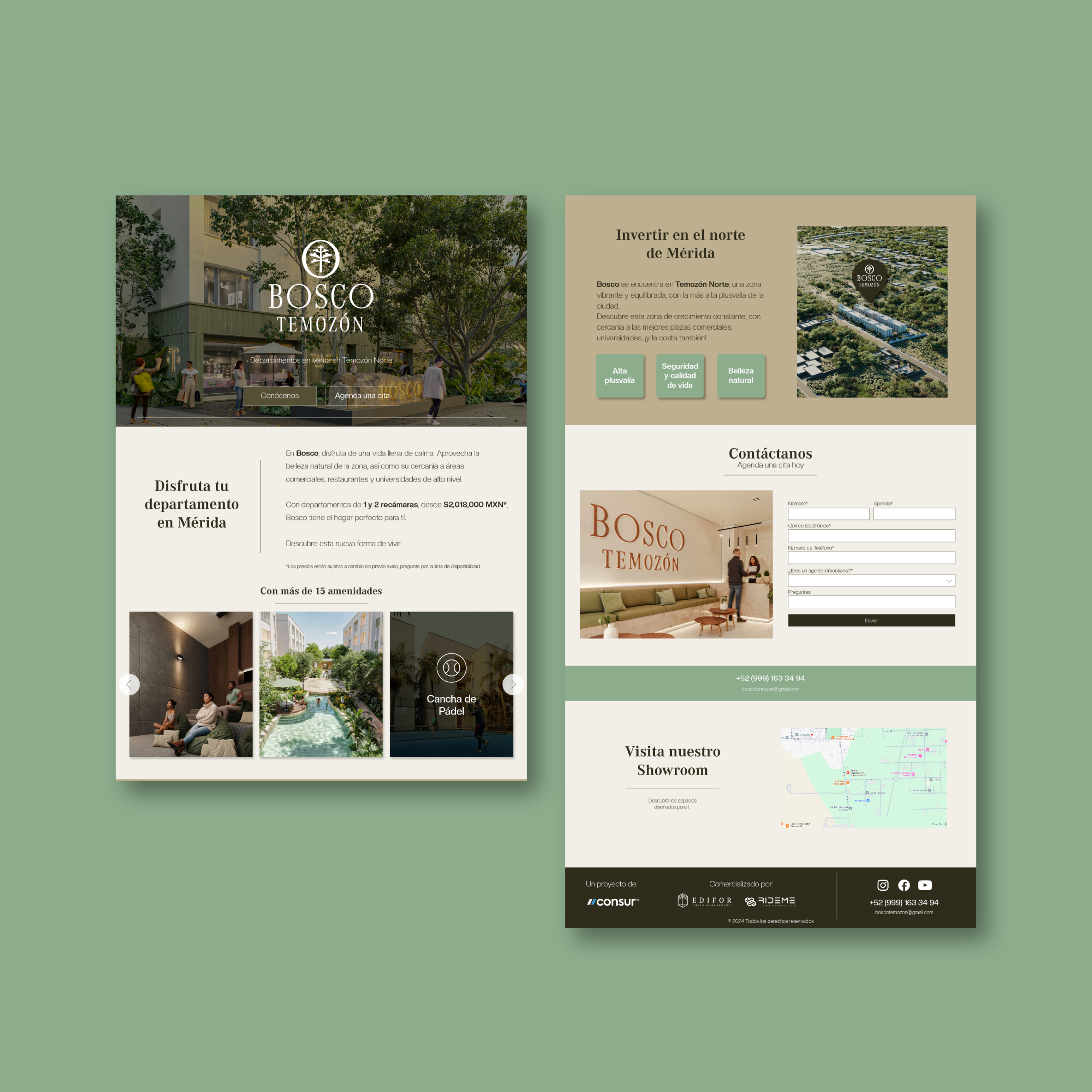
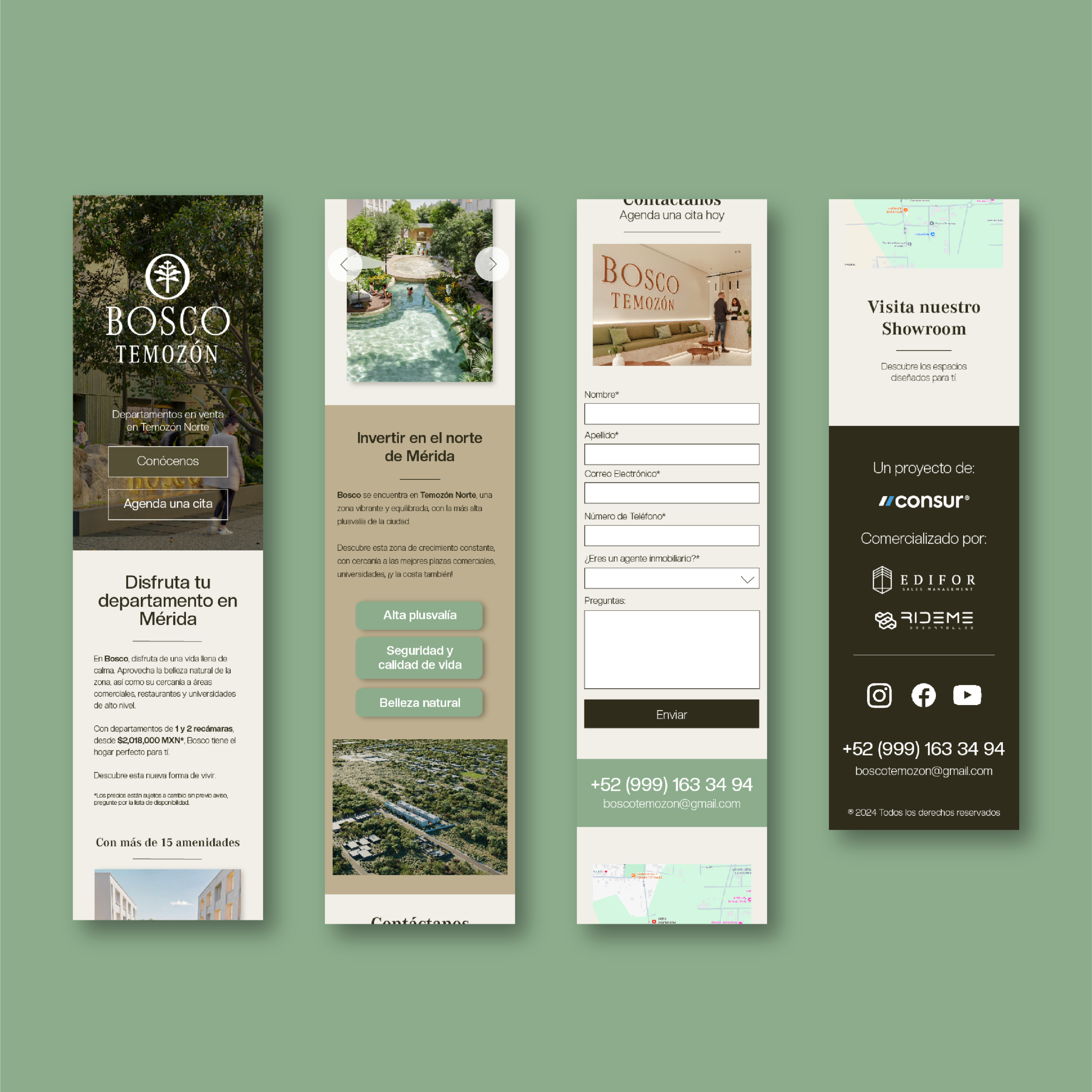
While working creating advertisement for real estate opportunities in the North of Mérida, Edifor Sales Management and Consur asked me to design a Landing Page for their project Bosco Temozón.
The goal, was to develop a simple page, which made it easier for their older target audience to find out about the project and to ask for more specific information.
This was a welcome challenge, a project where I had to carefully maintain an established visual identity, while creating something attractive and easy to use. I had to look at different references and into the mind of an investor, but overall, the result was a success.

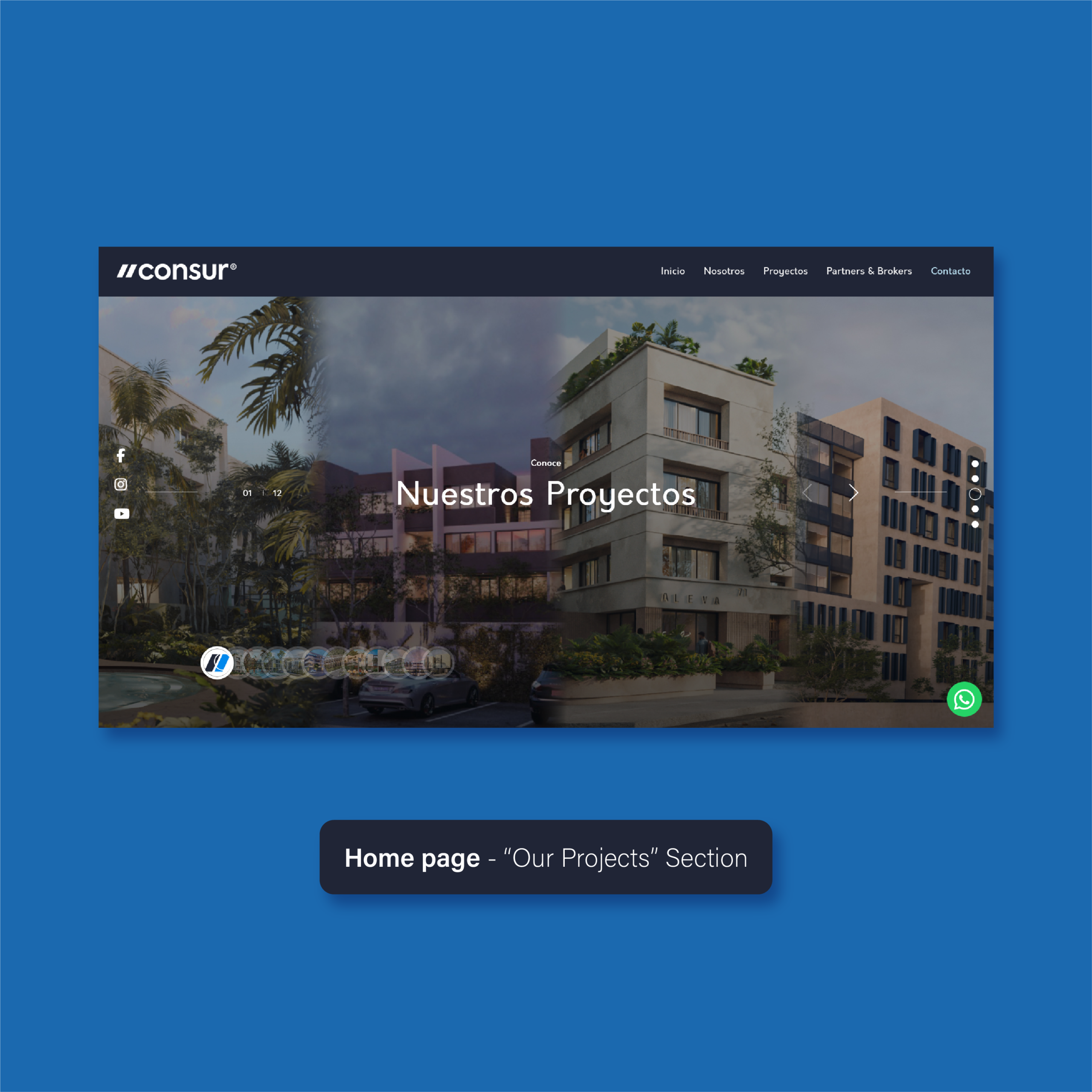
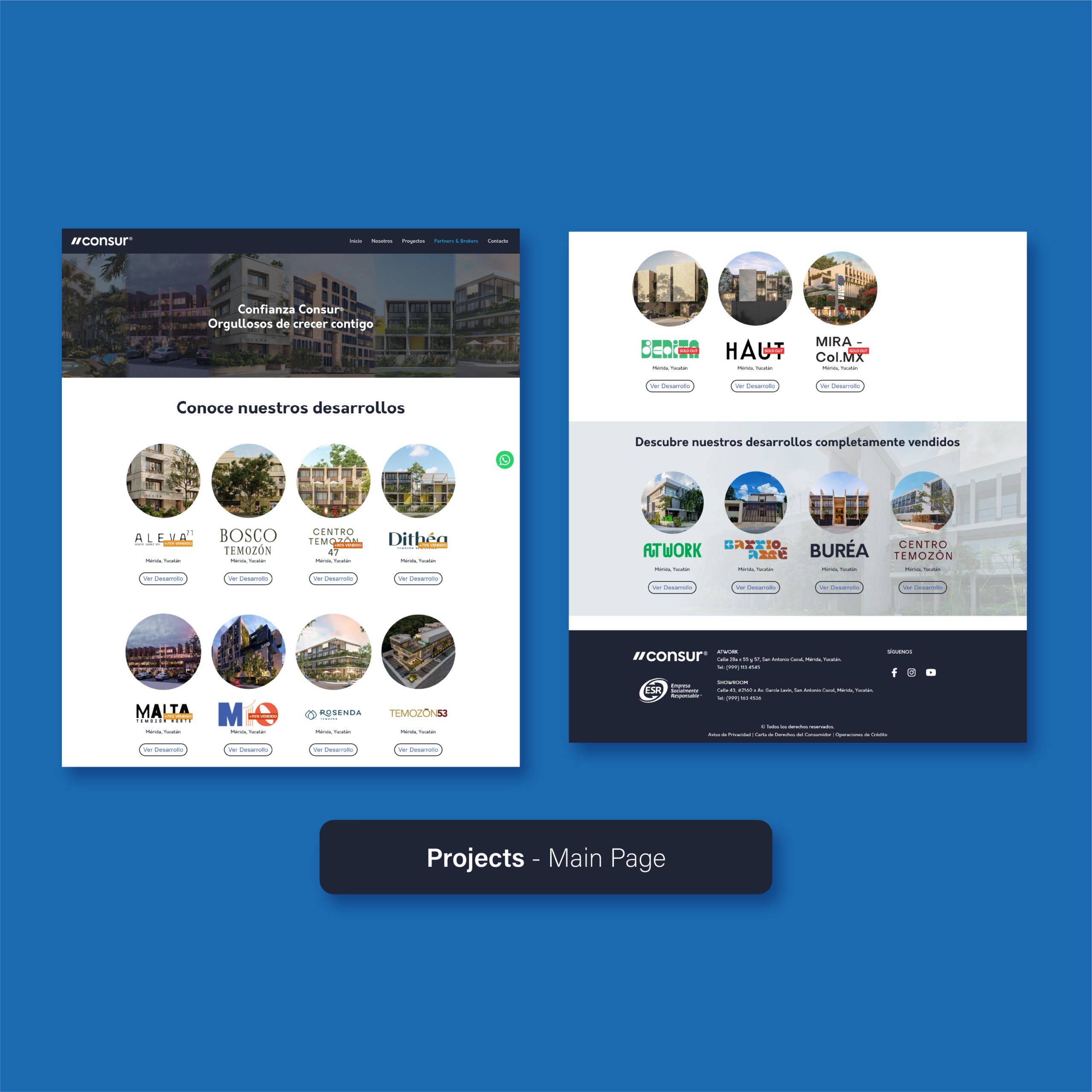
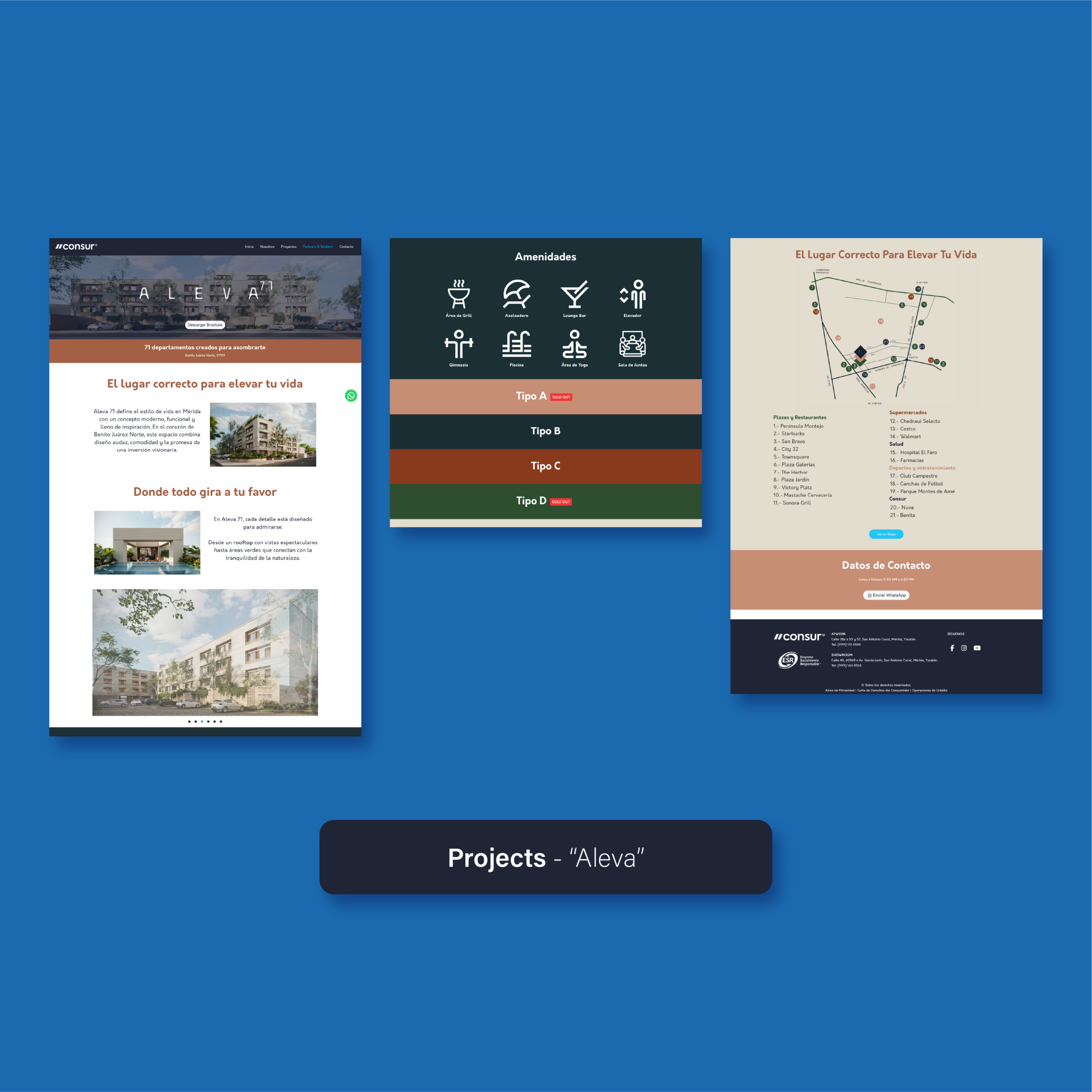
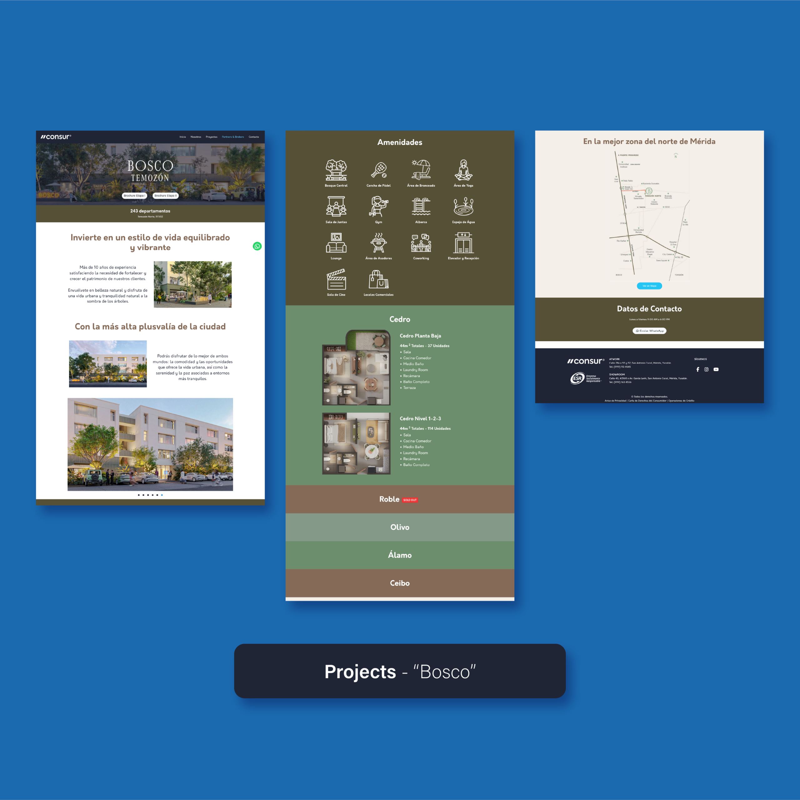
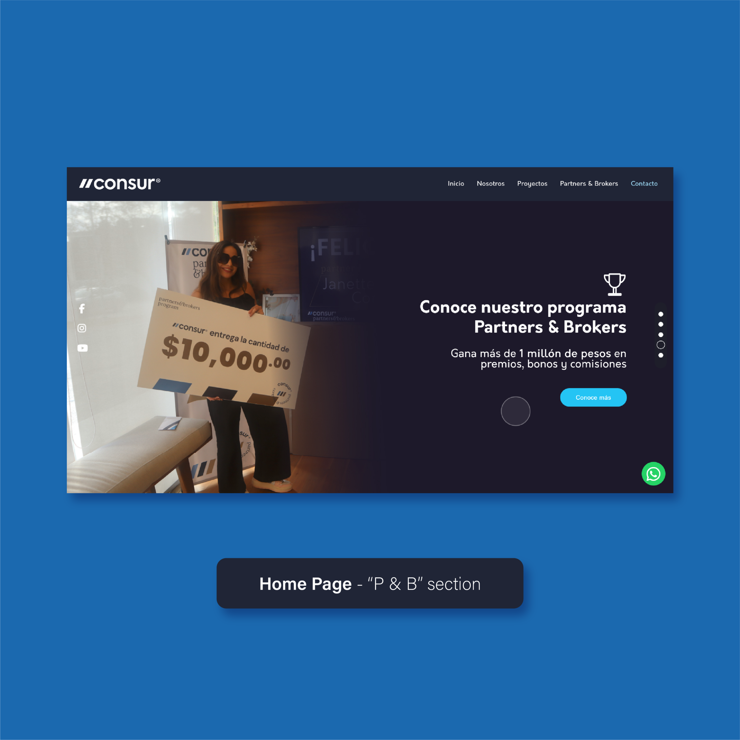
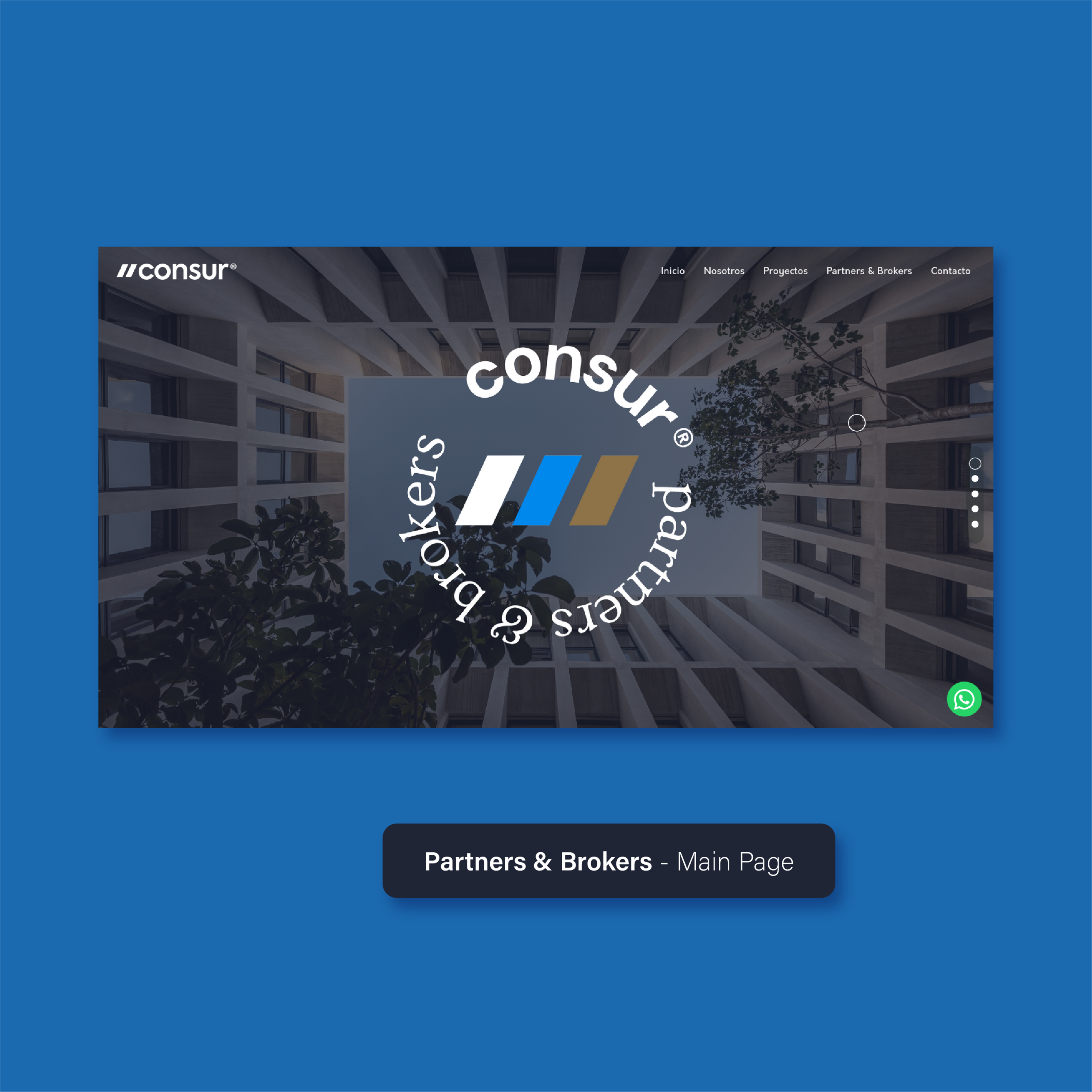
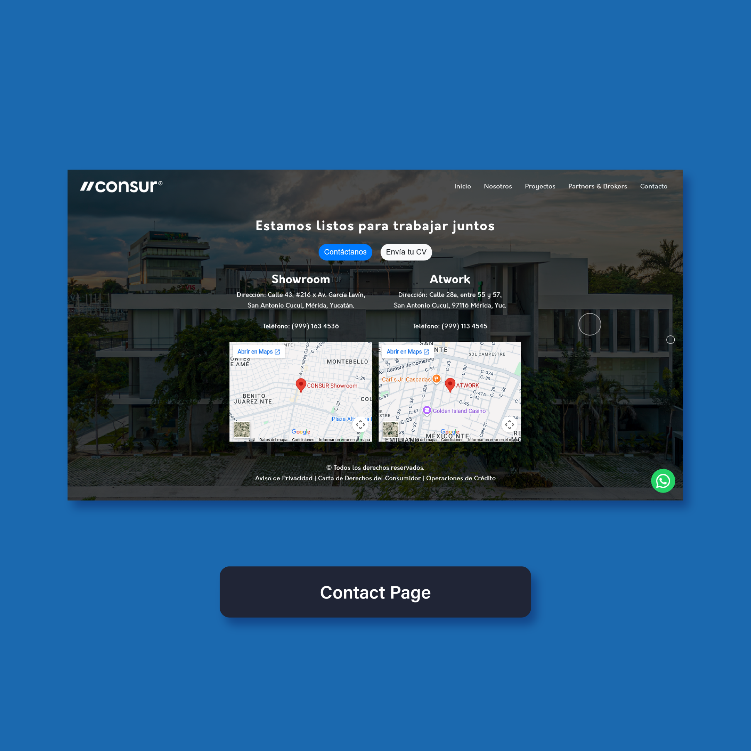
When I was working for Grupo Consur, one of the main tasks I was assigned was the redesign and developement of a new website. I was asked to make it more modern and intuitive, while still retaining all the important information for potential buyers.
For this project, I had to get into the headspace of property buyers, analyzing the kinds of information that they require in order to choose one property over another. I also had to determine what the best way to deliver that information would be, without confusing or overwhelming the user.
As I worked on this project, I had to collaborate with different people in the company, in order to create a result which satisfied everyone and which stayed in line with the brand identity. This proved to be a welcome challenge as it allowed me to develop collaborative skills, which are essential for this kind of project.
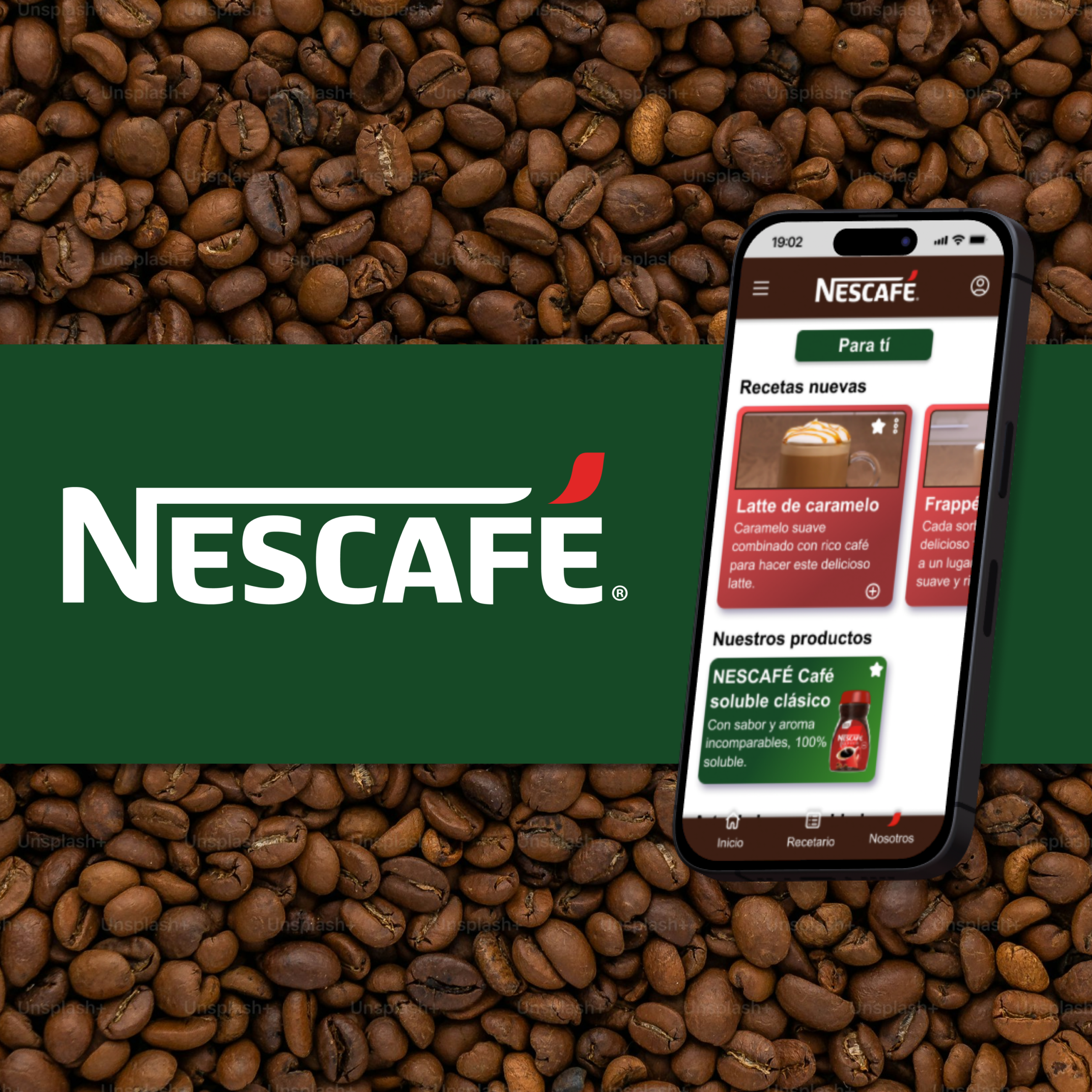
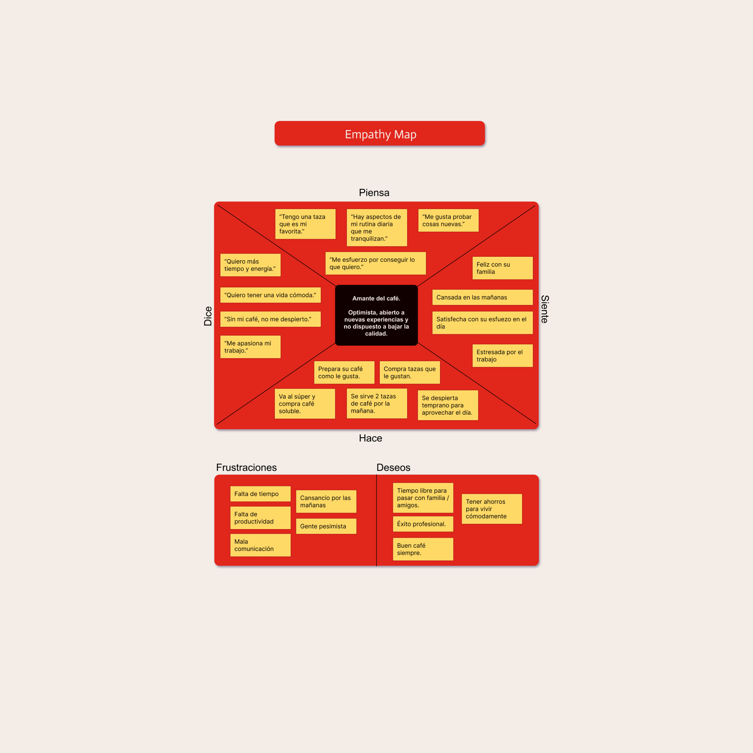
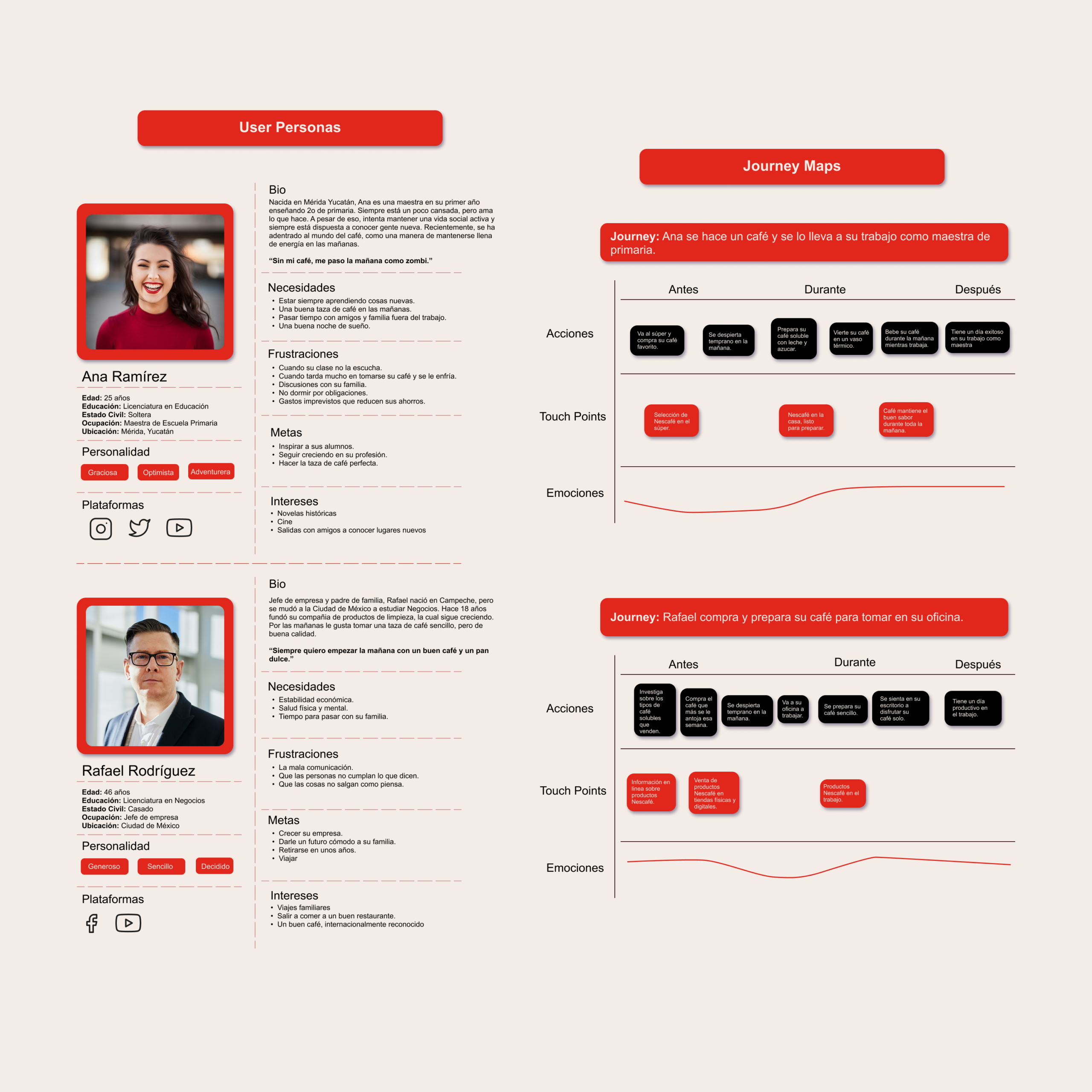
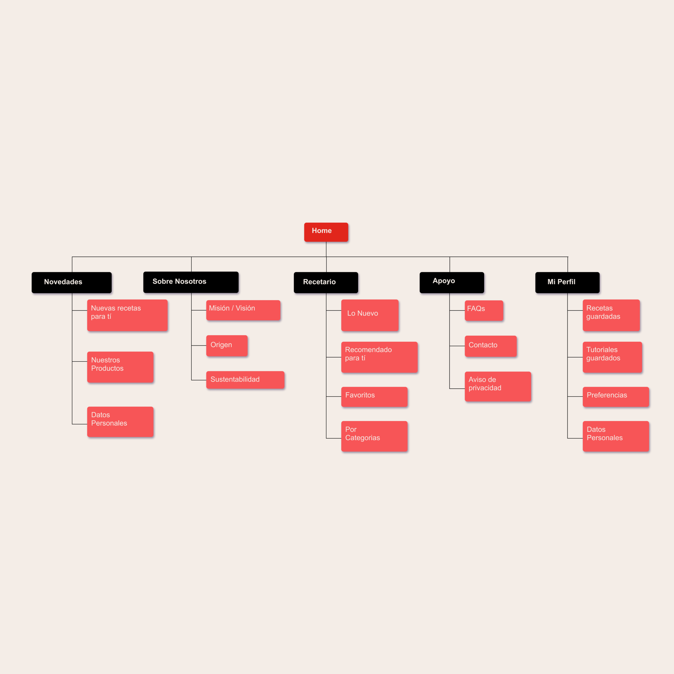
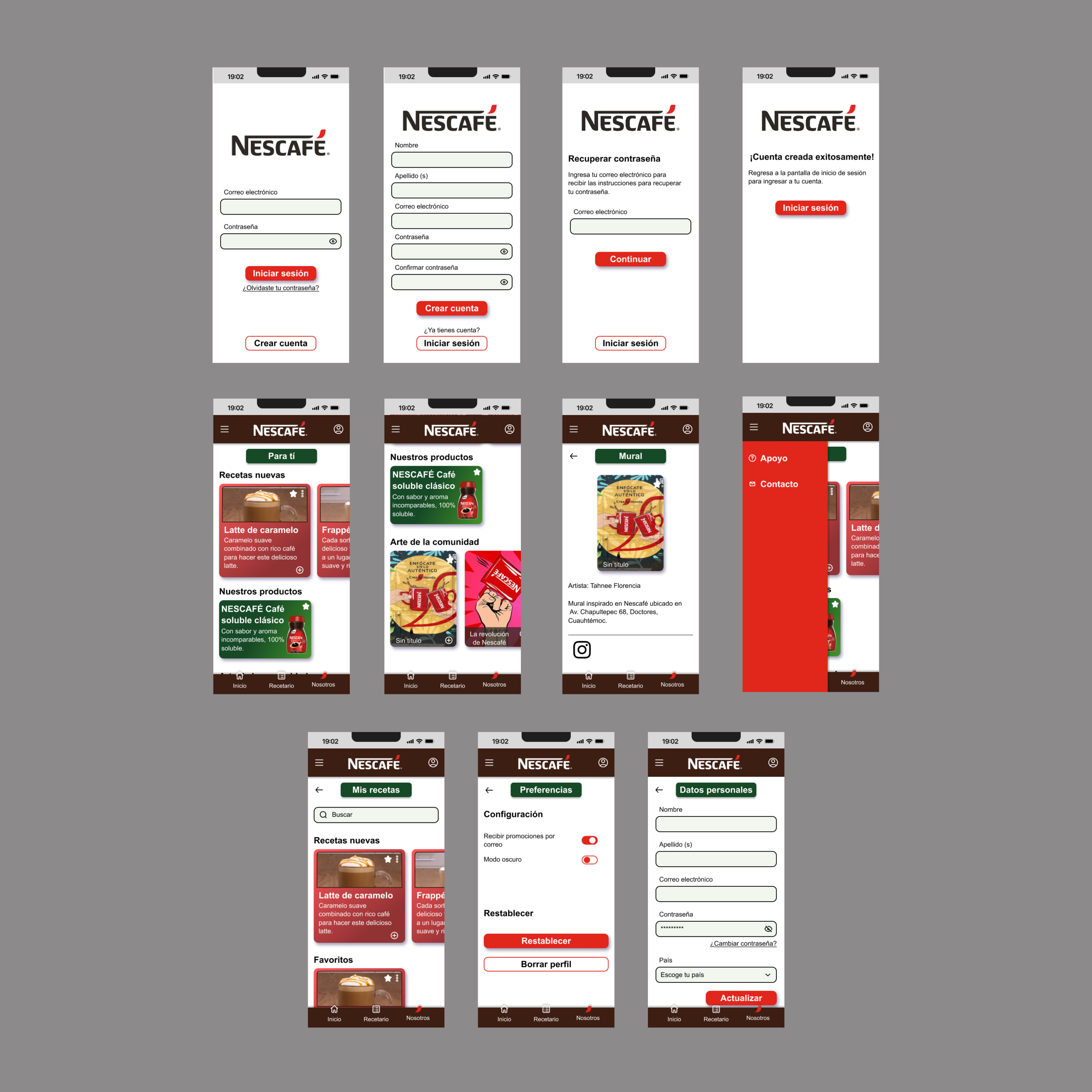
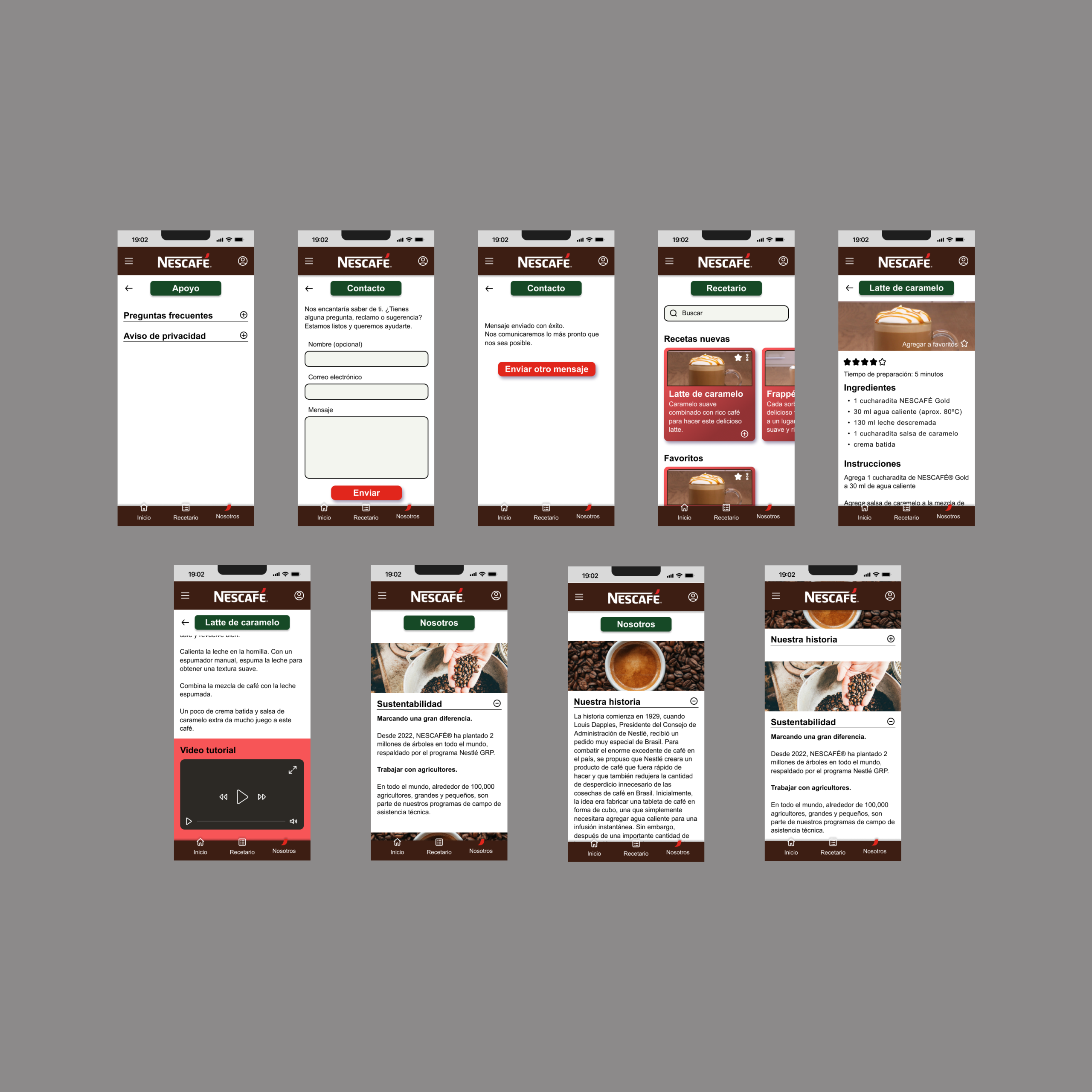
As part of a UX/UI Design course, I was asked to develop an app design for Nescafé. The goal was to create a digital interface which helped strengthen the brand’s relationship to its young user base.
For this goal, I first had to do extensive research on the habits and preferences of young coffee drinkers (20-35 years old). For this purpose I did a few interviews with potential users and with that information I created User Personas, Empathy maps and Journey maps, to better understand the context.
Once I had the necessary information, I decided on the functions that I wanted the app to have, created a Design System and created Wireframes of different fidelity levels.
Finally, once I had a High-fidelity Wireframe, I created a prototype using figma, and had real users test it on Useberry. This led me to see issues that I hadn’t noticed before and allowed me to improve on the design.
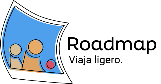
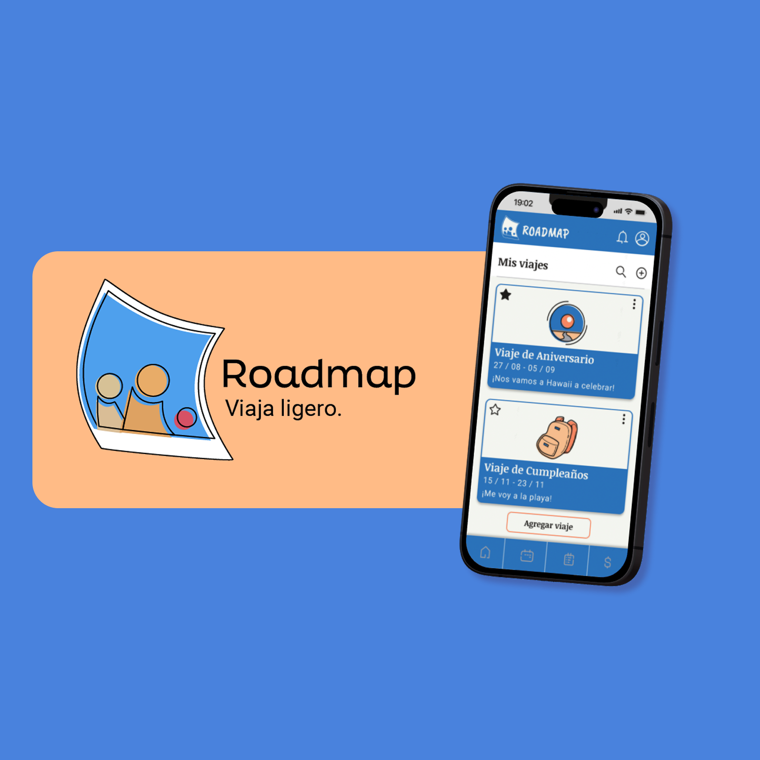
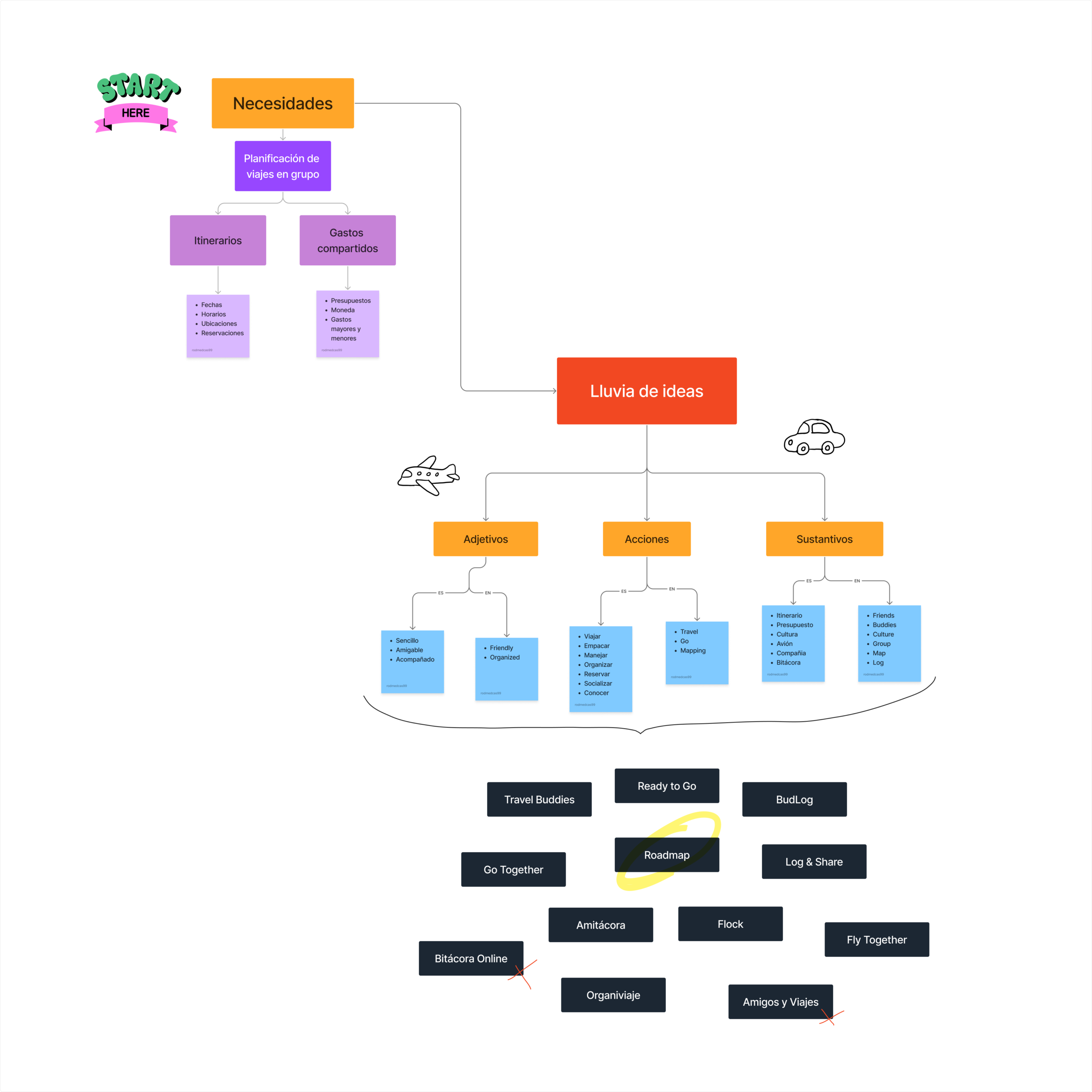
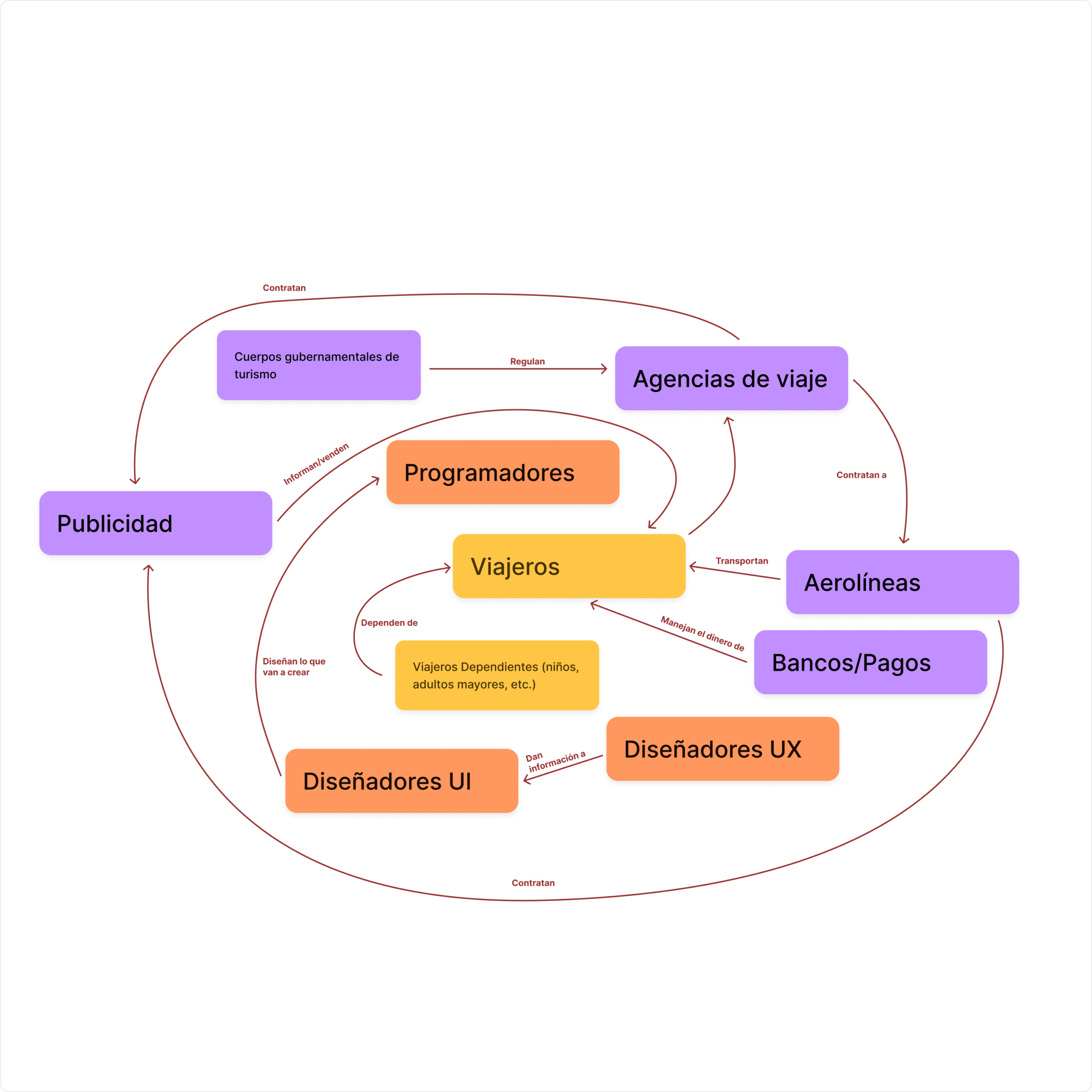
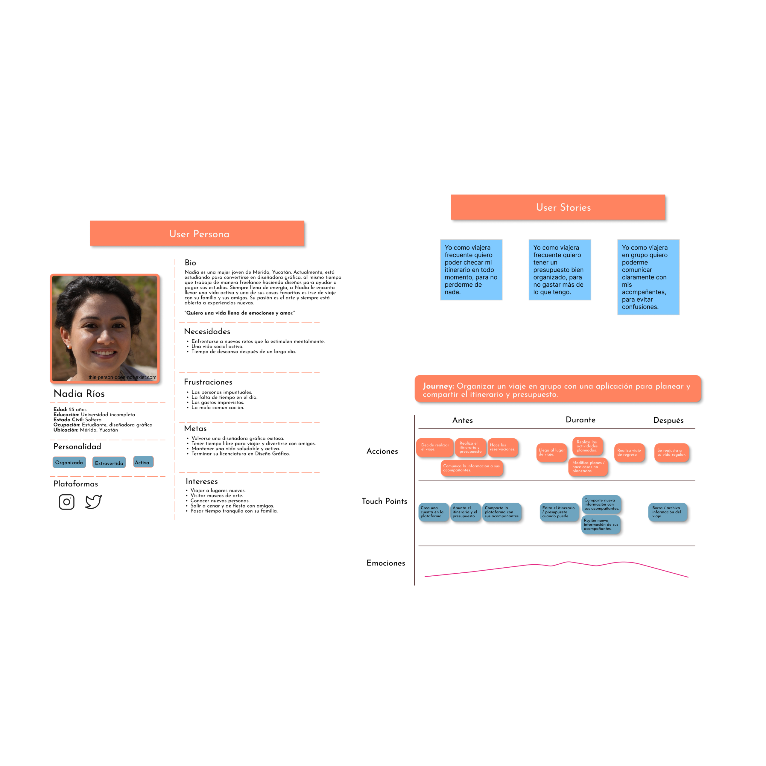
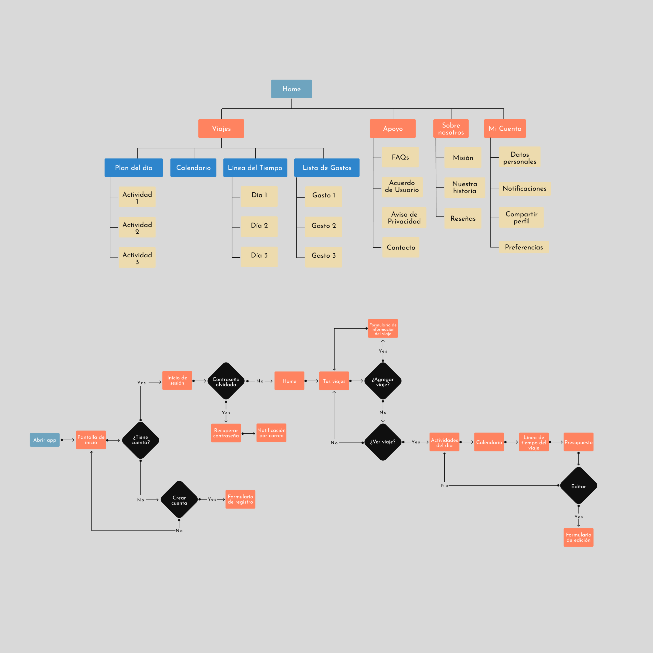
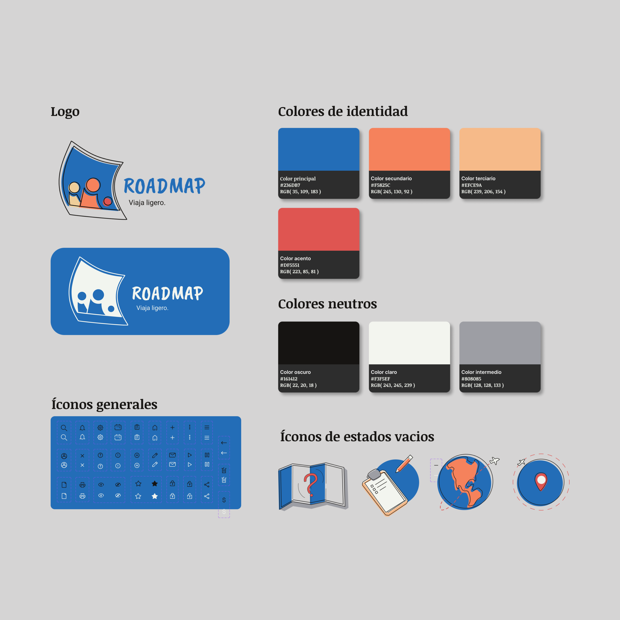
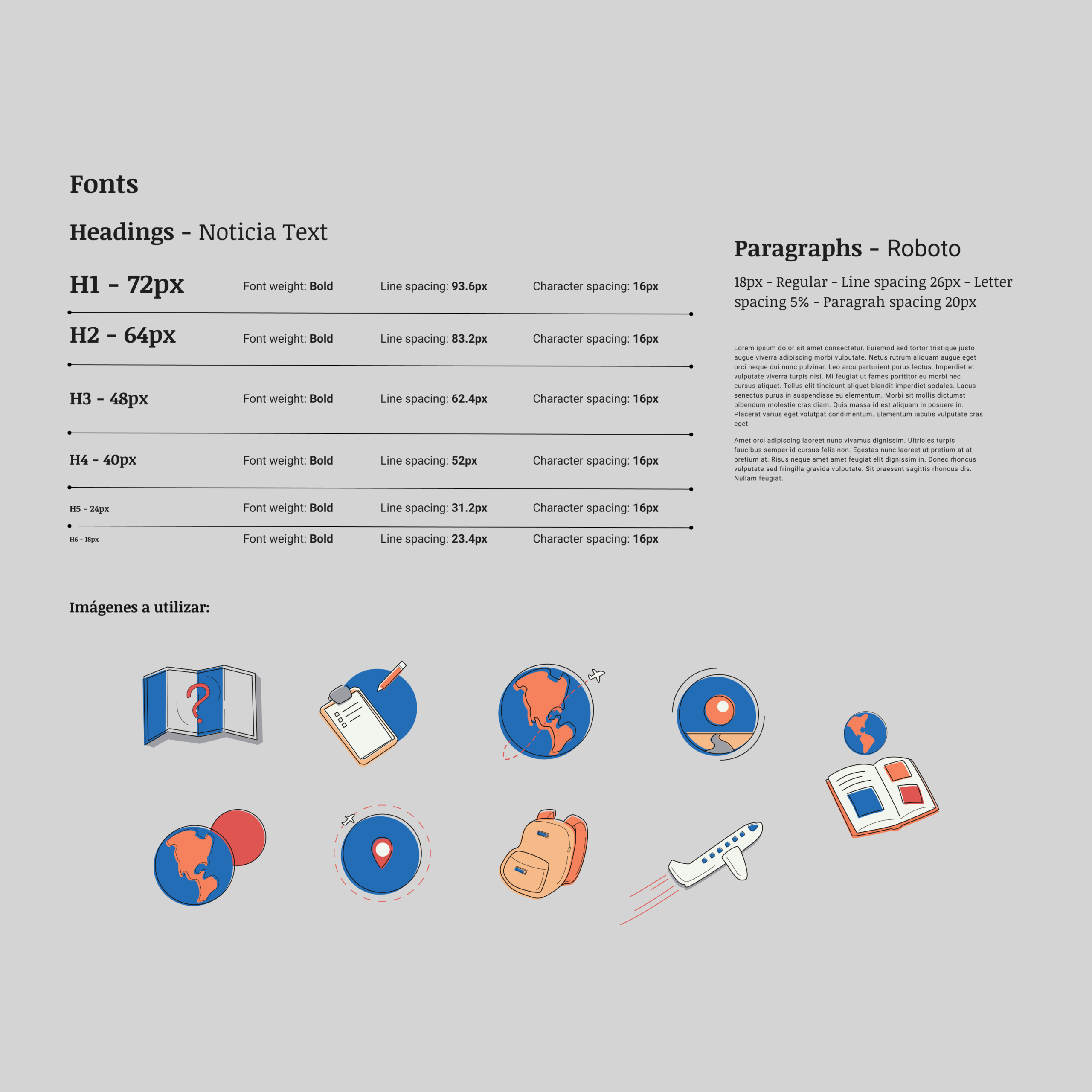
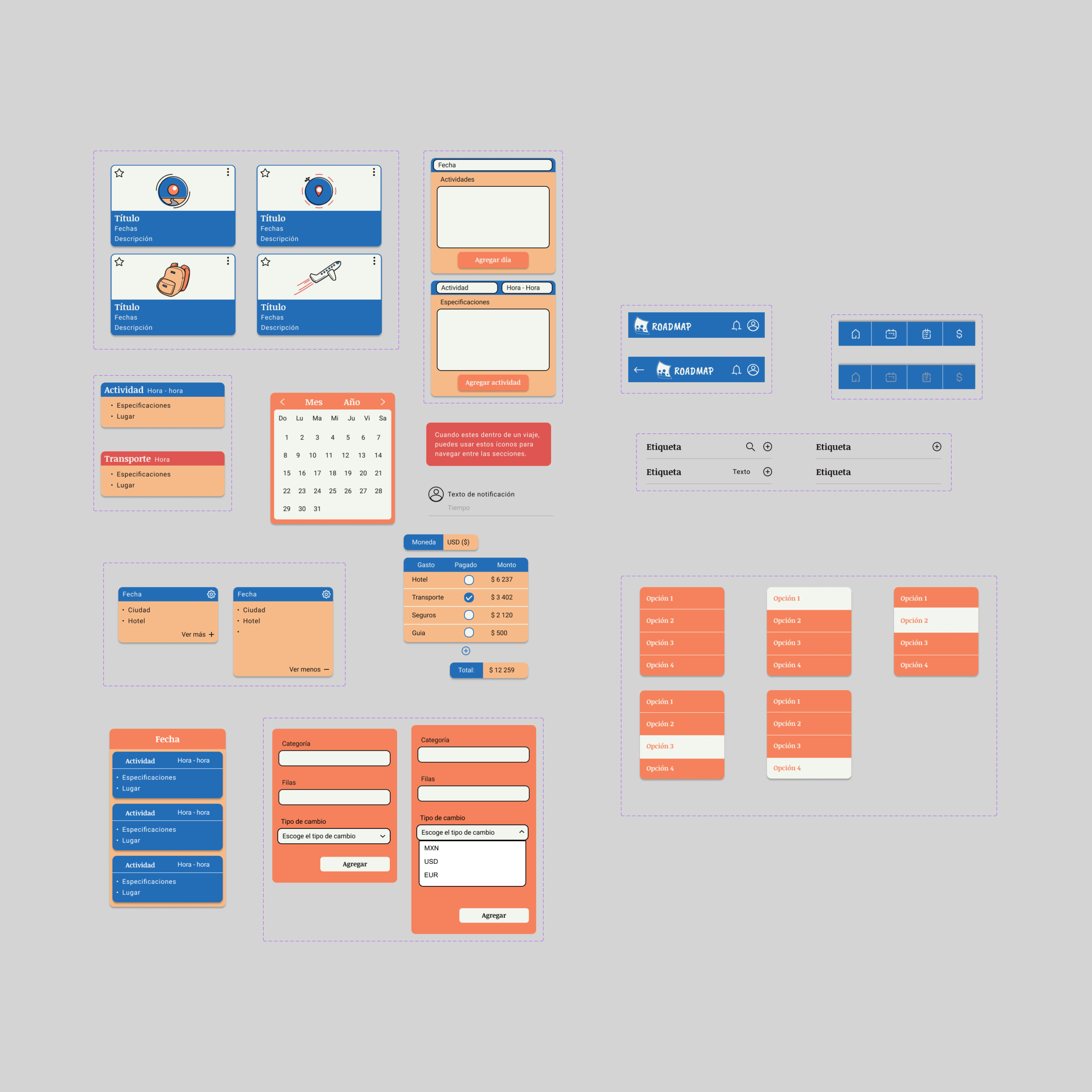
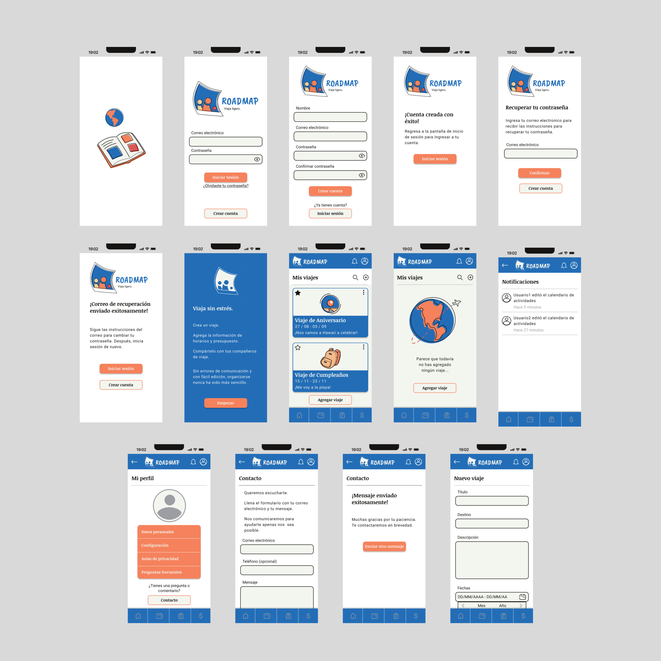
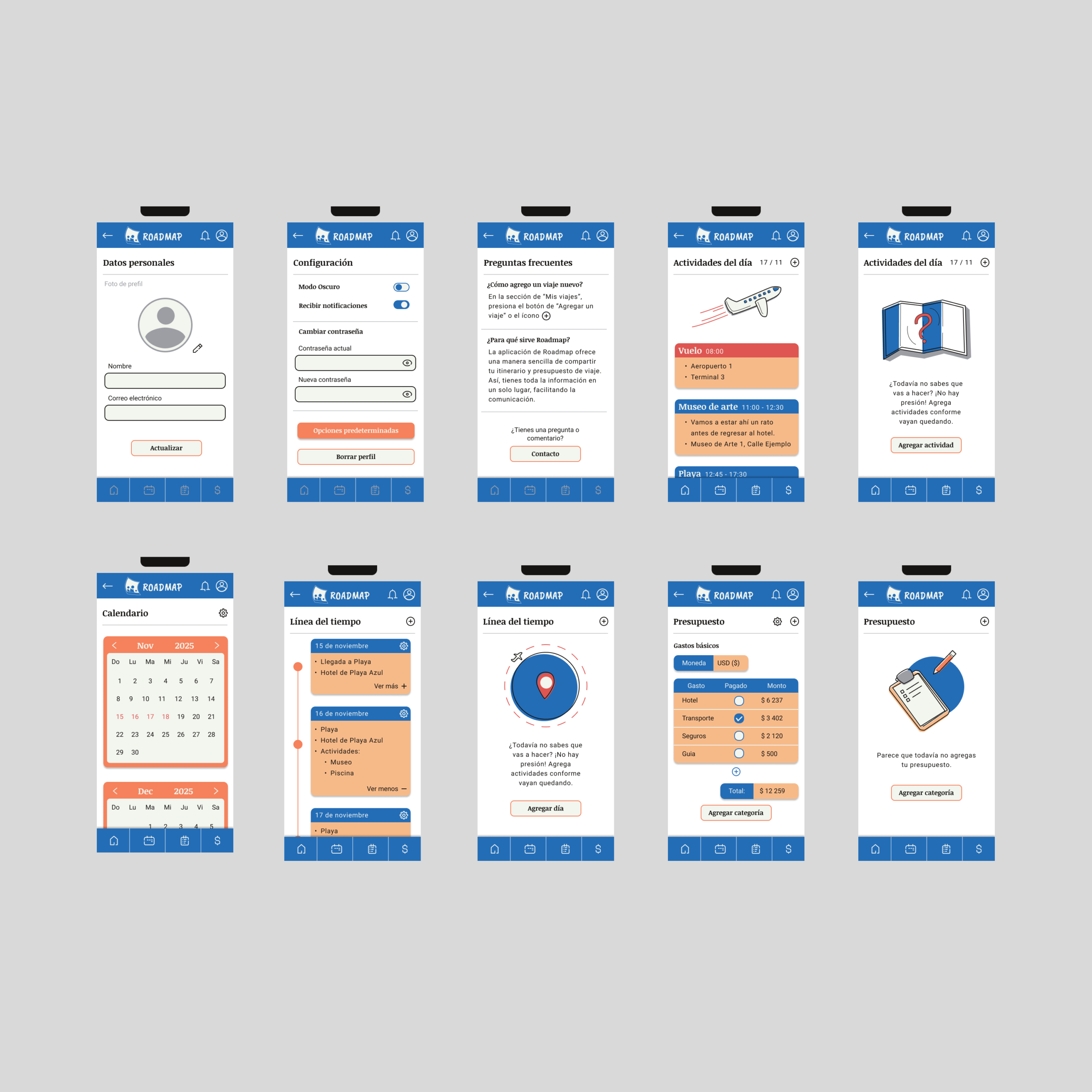
As part of a 10-month long UX/UI Design course, I developed the concept for a travel app. This is Roadmap, an app designed to help groups traveling together, by keeping a record of all key travel information in a platform that is easy to check and share at any moment.
For this project, I started from the research stage, by doing interviews, benchmarking and creating user personas, to create empathy with the consumer.
Once that was done, I created a visual identity fo the app, including making illustrations and a full brand identity manual. With these assets, I then developed wireframes and a prototype on Figma.
Finally, once I had a working prototype, I ran some tests with real users on Useberry and I made some final tweaks based on the feedback I received.
While working creating advertisement for real estate opportunities in the North of Mérida, Edifor Sales Management and Consur asked me to design a Landing Page for their project Bosco Temozón.
The goal, was to develop a simple page, which made it easier for their older target audience to find out about the project and to ask for more specific information.
This was a welcome challenge, a project where I had to carefully maintain an established visual identity, while creating something attractive and easy to use. I had to look at different references and into the mind of an investor, but overall, the result was a success.

When I was working for Grupo Consur, one of the main tasks I was assigned was the redesign and developement of a new website. I was asked to make it more modern and intuitive, while still retaining all the important information for potential buyers.
For this project, I had to get into the headspace of property buyers, analyzing the kinds of information that they require in order to choose one property over another. I also had to determine what the best way to deliver that information would be, without confusing or overwhelming the user.
As I worked on this project, I had to collaborate with different people in the company, in order to create a result which satisfied everyone and which stayed in line with the brand identity. This proved to be a welcome challenge as it allowed me to develop collaborative skills, which are essential for this kind of project.
As part of a UX/UI Design course, I was asked to develop an app design for Nescafé. The goal was to create a digital interface which helped strengthen the brand’s relationship to its young user base.
For this goal, I first had to do extensive research on the habits and preferences of young coffee drinkers (20-35 years old). For this purpose I did a few interviews with potential users and with that information I created User Personas, Empathy maps and Journey maps, to better understand the context.
Once I had the necessary information, I decided on the functions that I wanted the app to have, created a Design System and created Wireframes of different fidelity levels.
Finally, once I had a High-fidelity Wireframe, I created a prototype using figma, and had real users test it on Useberry. This led me to see issues that I hadn’t noticed before and allowed me to improve on the design.
As part of a 10-month long UX/UI Design course, I developed the concept for a travel app. This is Roadmap, an app designed to help groups traveling together, by keeping a record of all key travel information in a platform that is easy to check and share at any moment.
For this project, I started from the research stage, by doing interviews, benchmarking and creating user personas, to create empathy with the consumer.
Once that was done, I created a visual identity fo the app, including making illustrations and a full brand identity manual. With these assets, I then developed wireframes and a prototype on Figma.
Finally, once I had a working prototype, I ran some tests with real users on Useberry and I made some final tweaks based on the feedback I received.